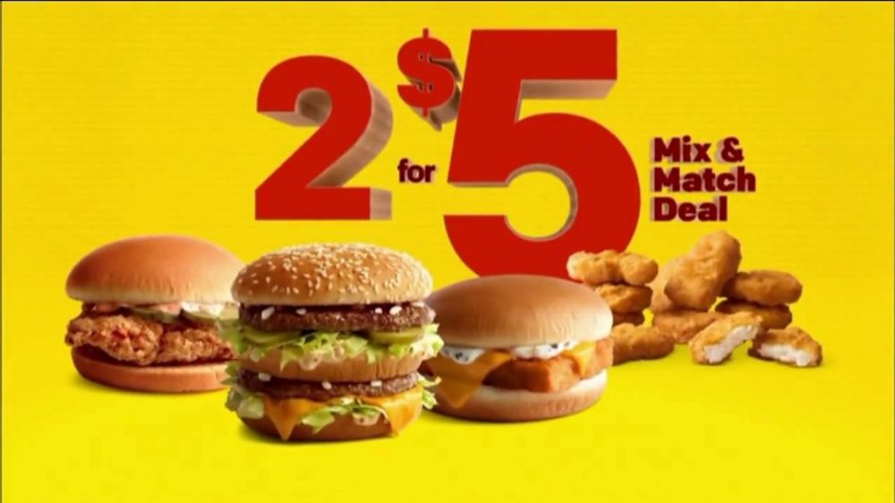
Design– I have chosen this because it is bright and grabs attention. It makes the food look good and is pleasing to the eye.
Introduction– McDonald’s is the company that came out with this ad. This is a recent design that came from the company. This is temporary and will not be available for much longer.
Analysis
- contrast- the colors in this ad are bright, attention grabbing, and make people stop.
- repetition- the food is similar looking, however upon closer look it is not the same food.
- alignment- the food is front and center as well as the text. The text is easy to read because it is the main focus.
- proximity- because the food is one of the most important parts of the ad they are close together. The text is behind the food.
- color- bright colors remind people that they are hungry. This is also a good deal money wise.
Conclusion– Overall McDonald’s does really well at making good advertisements. They make bright, delicious looking ads that grab attention.
